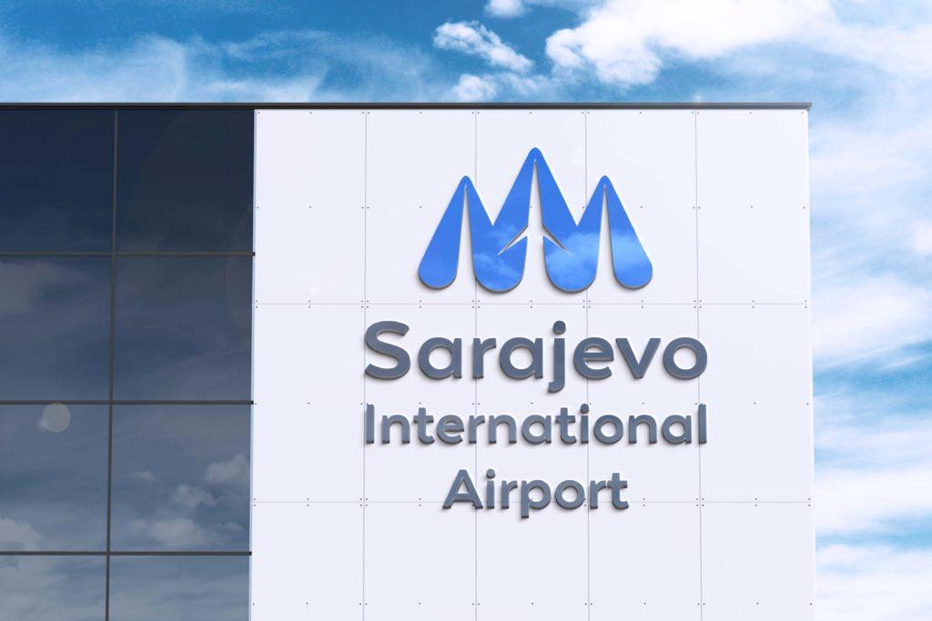
Sarajevo International Airport
Rebranding Concept 2021
Description
Rebranding Concept 2021 – Sarajevo International Airport
My approach was to create a strong future-focused identity system.
An identity system that emphasizes minimalism, simplicity, and geographical characteristics of this region.
The primary color is blue used to provide trust and safety.
Logo itself represents surrounding olympic mountains (showing geo uniqueness), arrow (that can be used as a navigational instrument within the airport), and airplane (core business).
Client:
Sarajevo International Airport
https://www.sarajevo-airport.ba/
Services:
Rebranding, Web design, Visual identity


